B2B Incentive Tracker
Role: Lead Designer | Tools: Figma, Claude | Platform: Workstation (B2B)
Scentsy, 2026

The Problem:
-
The incentive structure changed drastically from the previous years (going from 0-30,000+ points to a binary, star system with 0-26+ stars), calling for a redesign and logic update.
-
The sponsor and promote section of the incentive is historically hard to display as it is very text heavy
-
Bonus: I wanted to see how heavily I could lean on AI for this design
The Solution:
-
Simplified, color coded incentive tracker that showcases achievements while continuing to incentivize the next level
-
Ways to earn points (stars) is clearly broken out by category reducing confusion found in previous earning periods
The Impact:
-
I learned how to design with AI
-
An incentive tracker that feels new to help the field challenge beliefs that just because they didn't earn the last trip, they can still earn this one
-
Dynamic progress tracking
-
Clear communication of earned stars
States for 0-26+ stars
I passed off a pretty massive file to developers with 48 frames for mobile alone. Each order status has several versions: collapsed, expanded logged out, and expanded logged in. Although tedious to create, this gives a logged out visitor as much visibility as we can.
0 Stars
26 Stars
Incentive Achievement Bar
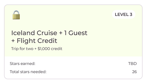
Every level has two states: one before the level is achieved and one to show it's been reached. We chose to highlight these at the top of the page since we know Consultants will share screenshots of this section on Facebook. Goal when working with Claude was to make this look very friendly and appealing to people who aren't Consultants.

Incentive Progress Bar
Right below the achievement bar, we have this progress bar that shows the progress towards all of the levels. Still screenshot friendly, but gives Consultants a bit more insight as to where their stars are coming from - something they may not want to share publicly.

Insight Into Star Attribution
In the previous design, these were broken into many different point sections. I leaned heavily on Claude to ruthlessly simplify the requirements so we could reduce them into as few sections as possible. Here is where we landed:


Frontline Report for Leaders
Some, but not all of our Consultants will be able to see a Frontline Report. This was challenging to design because there is alots of dense data to communicate. I worked closely with the developer to find a solution that supported our design for a quick load time, while also meeting Consultants' needs to see how every member of their frontline was currently performing.

Challenges
With the emergence of AI, "design" is now in the hand of masses. Here were two actual documents the team was provided to help make this project "easier". It was my first time navigating an outside team member providing design guidance like this and it posed a unique challenge explaining why something wouldn't work and why it's not as simple as turning an AI generated hand-out into a shippable, useful product. I have a feeling this will only become more common in my line of work!

